继上一篇对生涯卡片的改造后,我发现关于页面(About)的其他静态卡片也略显沉闷。为了让整个页面“活”起来,我进行了一系列的交互设计优化,包括给卡片添加金属光泽的擦亮特效、背景聚焦动画以及点击跳转功能。
本文将详细记录这些优化的实现过程。
1. 视觉升级:全员“擦亮”特效
为了给平淡的卡片增加质感,我引入了一种 CSS 扫光动画(Shine Effect)。当鼠标悬停时,一道半透明的白光会迅速划过卡片表面,模拟金属反光的效果。
CSS 实现
修改 themes/anzhiyu/source/css/_page/about.styl,在文件末尾追加以下代码。我一次性为自我介绍、个人数据、MBTI、游戏、特长、座右铭等多个卡片应用了此效果:
1
2
3
4
5
6
7
8
9
10
11
12
13
14
15
16
17
18
19
20
21
22
23
24
25
26
27
28
29
30
31
32
33
34
35
36
37
38
|
.author-content-item.myInfoAndSayHello::before,
.author-content-item.selfInfo::before,
.author-content-item.personalities::before,
.author-content-item.game-yuanshen::before,
.author-content-item.like-technology::before,
.author-content-item.buff::before,
.author-content-item.maxim::before,
.author-content-item.careers::before,
.author-content-item.aboutsiteTips::before {
content: "";
position: absolute;
top: 0;
left: 0;
width: 100%;
height: 100%;
background: linear-gradient(to right, transparent, rgba(255, 255, 255, 0.3), transparent);
transform: translate3d(-150%, 0, 0) skewX(-25deg);
transition: transform 0.5s;
z-index: 1;
pointer-events: none;
}
.author-content-item.myInfoAndSayHello:hover::before,
.author-content-item.selfInfo:hover::before,
.author-content-item.personalities:hover::before,
.author-content-item.game-yuanshen:hover::before,
.author-content-item.like-technology:hover::before,
.author-content-item.buff:hover::before,
.author-content-item.maxim:hover::before,
.author-content-item.careers:hover::before,
.author-content-item.aboutsiteTips:hover::before {
transform: translate3d(150%, 0, 0) skewX(-25deg);
}
|
2. 交互升级:音乐卡片的“聚焦”体验
对于音乐偏好卡片,我不希望它只是静态的。当鼠标悬停时,背景专辑封面缓慢放大,营造出一种“聚焦”或“沉浸”的听歌氛围。同时,点击卡片应直接播放歌单。
样式优化 (about.styl)
1
2
3
4
5
6
7
8
9
|
.author-content-item.like-music {
background-size: 100% !important;
transition: background-size 0.5s ease-in-out !important;
cursor: pointer;
}
.author-content-item.like-music:hover {
background-size: 120% !important;
}
|
逻辑修改 (about.pug)
支持点击跳转并携带参数,让访客能直接听到我推荐的歌单:
1
2
3
4
| .author-content-item.like-music(
style=`background: url(${music_bg}) top / cover no-repeat;`
onclick=`pjax.loadUrl("/music/?id=6909251788&server=netease")`
)
|
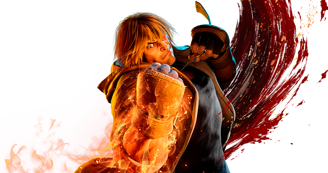
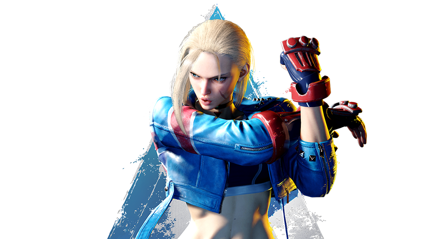
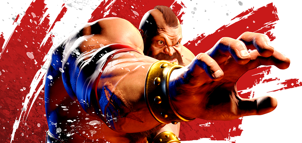
3. 功能补全:游戏卡片外链
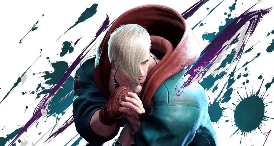
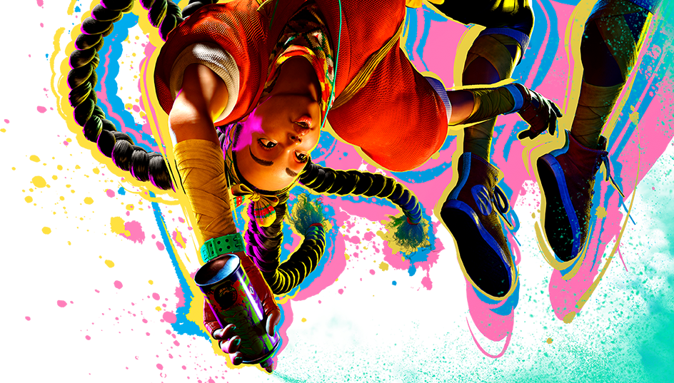
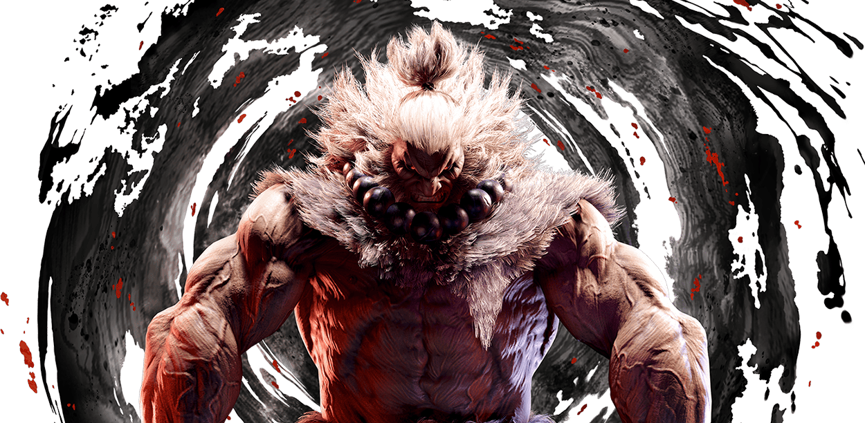
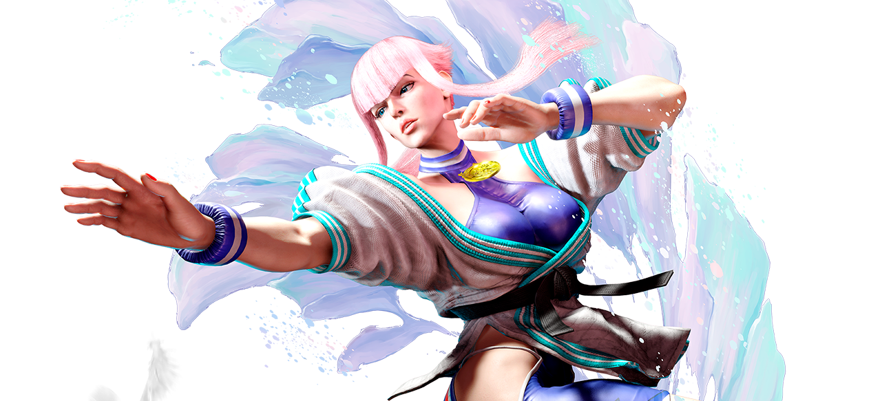
同样地,对于展示《Street Fighter VI》的游戏卡片,我希望点击它能让感兴趣的朋友直达官网。
修改 themes/anzhiyu/layout/includes/page/about.pug:
1
2
3
4
| div.author-content-item.game-yuanshen(
style=`background: url(${game_bg}) top / cover no-repeat; cursor: pointer;`
onclick=`window.open('https://www.streetfighter.com/6/zh-hans', '_blank')`
)
|
这里使用了 window.open 而不是 pjax.loadUrl,因为是要跳转到外部网站。
总结
通过上述几步简单的 CSS 和 Pug 模板修改,我们将原本相对静态的信息展示页,变成了一个充满微交互的生动页面。每一个光影的流转、每一次背景的缩放,都在无形中提升了用户的浏览体验。
快去给你的博客关于页也加上这些特效吧!
